

Reworked post creation and post list UX


Hey!
We just shipped a pretty big UX update to how you create and manage posts.
The old post creation screen was a long vertical scroll. Everything stacked on top of each other - profiles, content, platform settings, scheduling. It worked, but it felt heavy. We reworked it into a two-column layout: profiles and platform-specific settings sit side by side, and the "when to post" block is cleaner and more compact. Content type selectors are smaller too - radio buttons instead of big cards.
What changed:
-
New post creation layout - less scrolling, easier to scan.
-
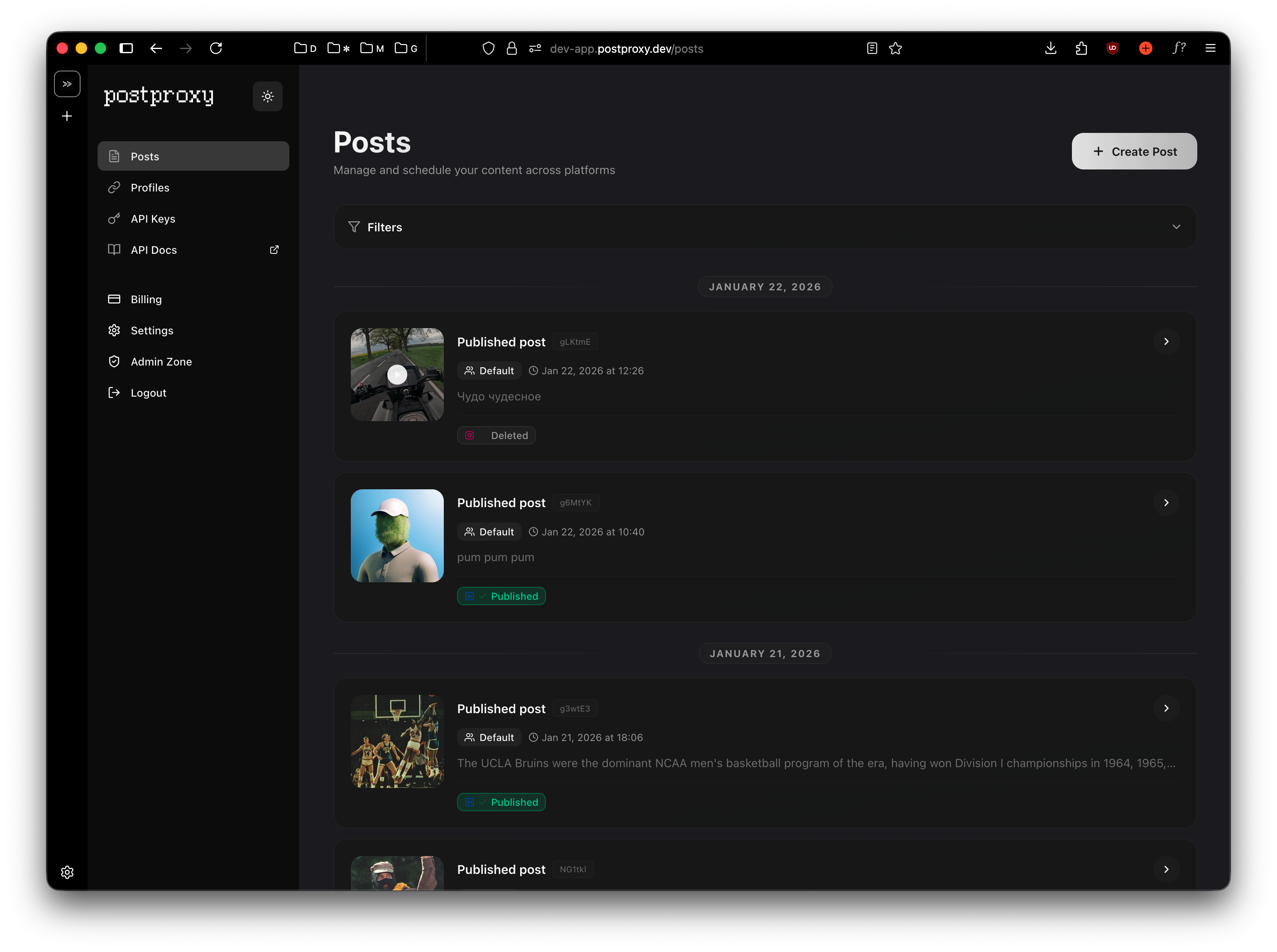
Compact post list: each post card now shows a horizontal layout with media thumbnail on the left and content on the right. Profile group badge, platform icons, and timing info are all visible at a glance without taking up half the screen.
-
Filters on the post list: filter by status (published, scheduled, draft, failed) to quickly find what you need. Useful once you have more than a handful of posts.
-
Smaller content type selectors: switched from large card-style selectors to compact radio buttons for choosing between post, reel, story, etc.
Overall, it just feels tighter. Less visual noise, more information density.
We're still iterating. If something feels off, let us know.
Cheers ✊🏻