

Reworked post creation UI


Hey!
We reworked the post creation page in the app.
The old flow did the job, but once you added media, multiple platforms, platform-specific settings, scheduling, or a thread, the page started to feel more like a configuration form than a place to publish something.
The new version is much easier to follow.
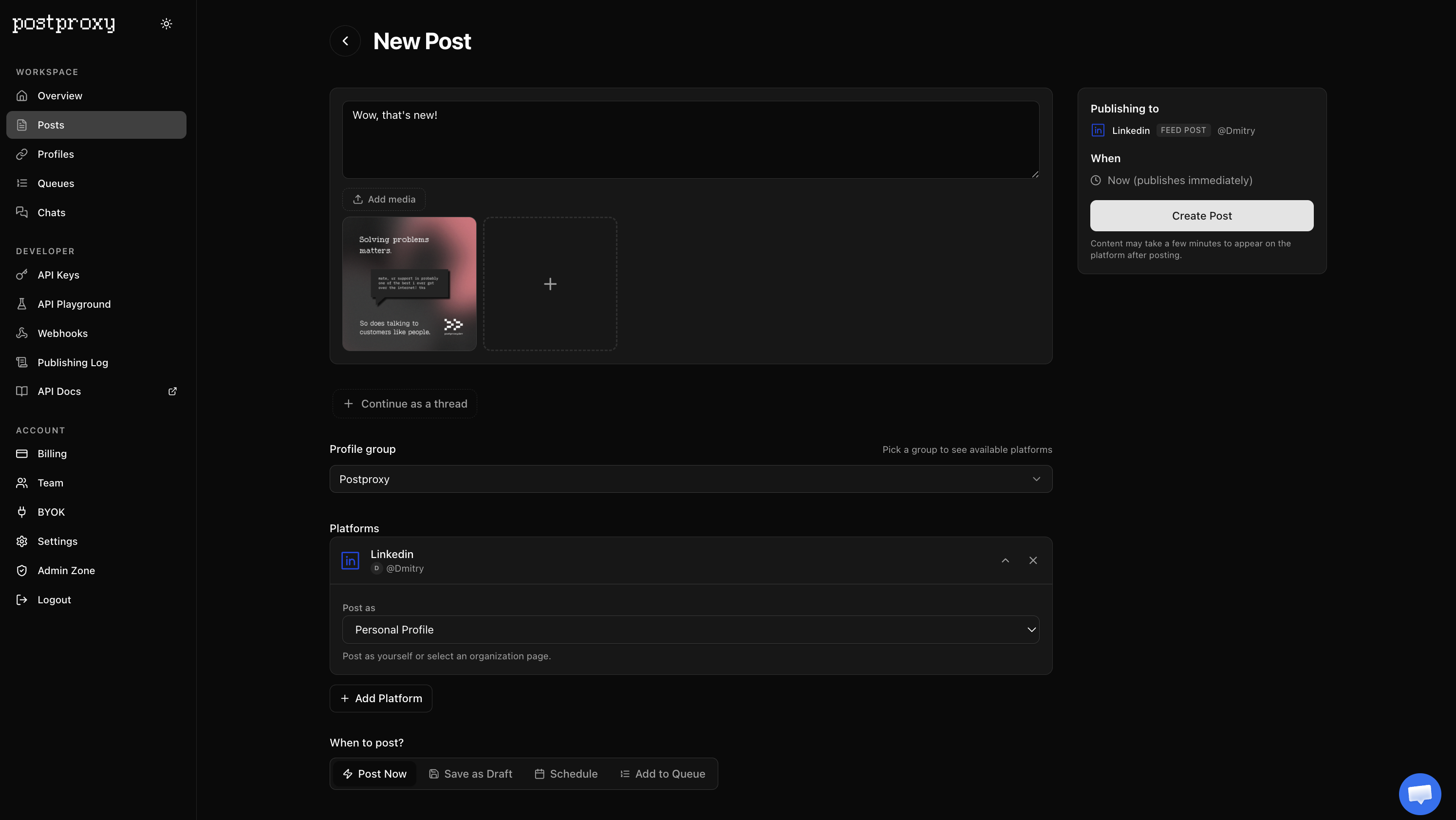
The composer stays focused on the post itself: text, media, and thread structure. Profile group and platform selection sit below it, with platform-specific settings grouped where they belong instead of competing for attention. On the right, a compact summary shows exactly what will be published, where, and when.
A few things are noticeably better now:
-
media is easier to add and review
-
thread creation is more obvious
-
platform-specific options are easier to scan
-
publishing mode is clearer: post now, save as draft, schedule, or add to a queue
-
the final summary makes it harder to publish to the wrong place by accident, which remains a popular human hobby
You can try it directly in the app: https://app.postproxy.dev/posts/new
We’ll keep sanding down these parts of the app as we go. Small pieces of friction add up surprisingly fast.
Cheers,
Dmitry